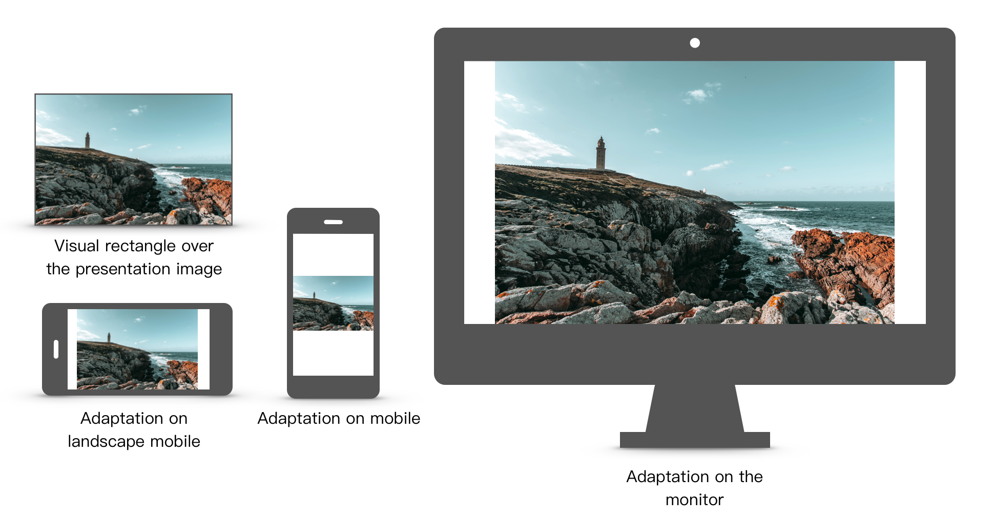
The same whiteboard room may be displayed on various devices. Such as monitors, mobile phones, tablet computers, etc., these devices have different sizes. How to display reasonable and appropriate images on different devices is a problem that needs to be carefully considered in the business design process.
¶ Perspective
Netless interactive whiteboard solves the problem of screen adaptation through the "perspective". On the whiteboard, users can directly change their perspective through platform-related operations. For example, Web users can zoom in and out of the view using the mouse wheel, and use the hand tool to move the view horizontally. Mobile users can zoom in and zoom out the angle of view with two-finger zoom gestures, and move the angle of view horizontally with two-finger movement gestures.
In addition, you can also actively call SDK methods to move and zoom in or out. You can even lock the viewing angle boundary. In this mode, users can move the viewing angle freely through platform-related operations, but if the viewing angle exceeds the lock boundary you set, it will be automatically pulled back.
You can also call the SDK methods to prohibit users from affecting the perspective through device operations, so as to completely confine the user perspective.
For the above, you can refer to the platform-related documents for details.
¶ World Coordinate System
Various graphics drawn on the whiteboard have their own coordinates. We can use four scalar, originX, originY, width , height (the x, y coordinates, width, and height in the upper left corner) describe the position of the graphics on the whiteboard. These four scalar coordinates are the world coordinates of the graph.
As the angle of view is shifted and zoomed, we can see that the graphics drawn on the screen are shifting and zooming. But we regard this situation as the viewing angle moving relative to the whiteboard, rather than the graphics on the whiteboard itself moving. Specifically, in this case, the view coordinates of the graphics have not changed, but the world coordinates of the perspective are changed.
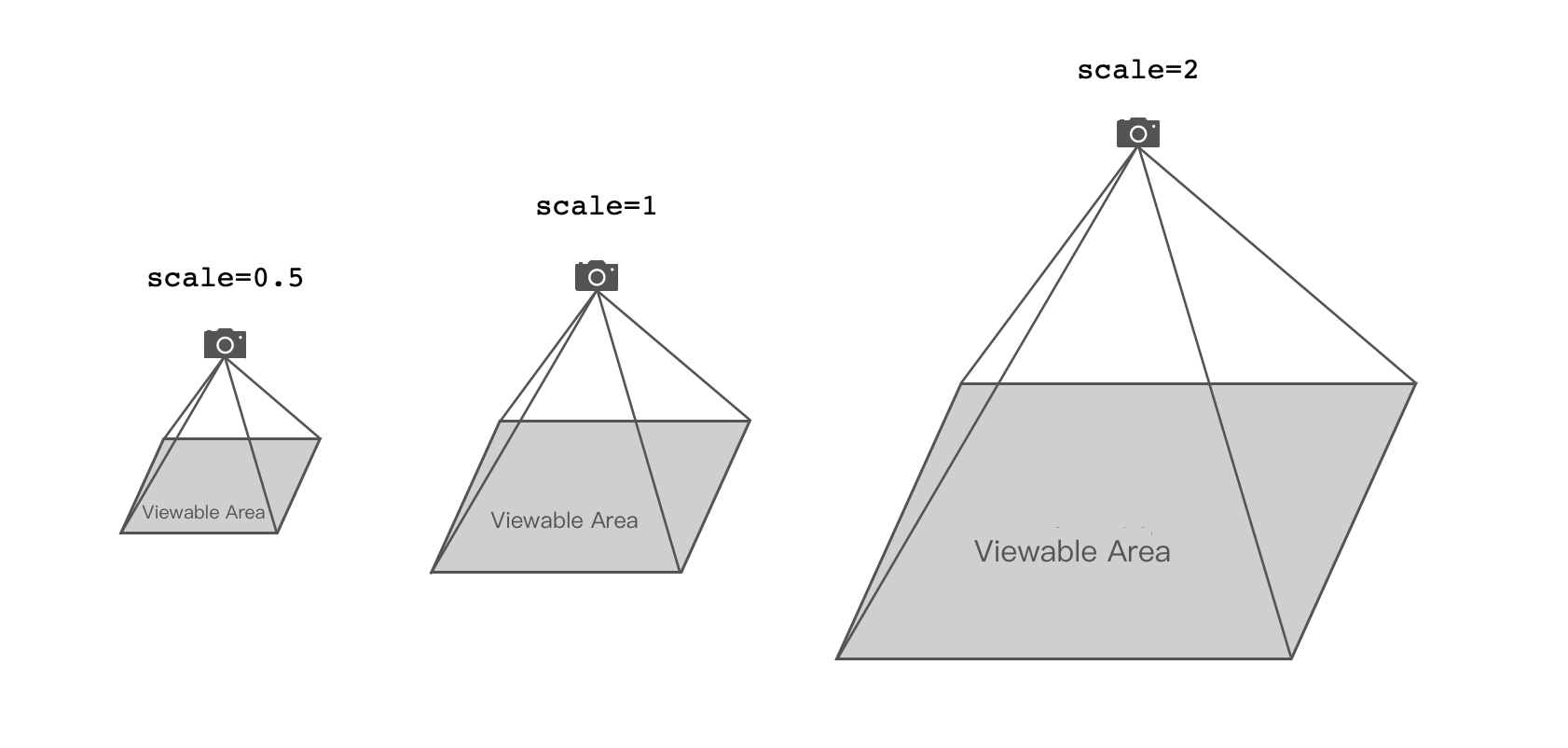
The position of the angle of view relative to the whiteboard is described by three scalars, centerX, centerY, and scale. Among them, (centerX, centerY) represents the world coordinate of the position on the whiteboard that the point on the center of the screen is aligned with in this viewing angle. scale is the zoom ratio, which indicates how many times the graphics on the whiteboard is magnified under this viewing angle. For example, when scale=1, any graphics under this viewing angle will maintain the original size, when scale=2, the graphics will be enlarged to 2 times the original size, scale=0.5 When, the graph is reduced to 1/2 of the original size.
We imagine a camera above a whiteboard with its axis perpendicular to the whiteboard. The coordinates of the intersection of the camera's central axis and the whiteboard plane are centerX and centerY. The distance between the camera and the whiteboard plane is inversely proportional to scale. When we move the camera in space, the mirror image seen by the camera will change, and the three scalars will change accordingly.

¶ Visual rectangle
In the previous chapter, we described how to locate the perspective by defining the three scalar coordinates of the perspective in the world coordinate system. In this chapter, we define the visual rectangle to reverse the angle of view.
The visual rectangle is an abstract concept. You can think of it as an "invisible rectangle" in the whiteboard, and the viewing angle will be automatically adjusted to meet the following conditions at the same time.
- The center of the rectangle must be the center of the viewing angle
- The content within the rectangle must be seen
- The viewing angle must be zoomed so that the two sides of the rectangle just touch the edge of the screen
The visual rectangle is a tool that can be used to control the perspective. We can move the visual rectangle or modify its size to indirectly adjust the viewing angle. We can adapt to different devices by focusing on the visual rectangle instead of the perspective. We usually set the visual rectangle to the content that needs attention (such as the scope of the PPT), so as to ensure that the content that needs attention (such as the aligned PPT) can be displayed completely** in devices of different sizes. .

¶ Hosts and Followers
In the real-time room, we can choose one of the following three viewing angle modes.
- Anchor Mode: You can actively adjust the viewing angle and synchronize your own viewing angle information to the entire room.
- Follow Mode: The angle of view will follow that of the anchor.
- Free Mode: You can actively adjust the angle of view without being affected by or affecting other characters in the room.
By default, all users in the room are in free mode, and everyone can freely adjust their viewing angles without affecting each other's viewing angles. When one person switches to anchor mode, the remaining people will automatically switch to follow mode. When the host actively switches back to free mode, other followers automatically switch back to free mode.
There is at most one anchor in the same room. If there is already an anchor in the room and someone actively switches to anchor mode at this time, the original anchor will be automatically switched to follow mode.
All followers will follow the anchor’s perspective. If a follower tries to adjust the perspective, the follower will be automatically switched back to free mode.
If your business scenario does not want followers to be switched back to free mode due to active operation of the perspective, you can prohibit the follower's perspective operation.
The host broadcasts the world coordinates and size of the area (this is a rectangular area) visible on his screen on the whiteboard to the entire room. After receiving this rectangular area, the follower will treat it as his own visual rectangle This adjusts the viewing angle. In this way, if the anchor actively adjusts the perspective, the follower will immediately follow the anchor's adjustment.
¶ Host mode or visual rectangle?
Sometimes, we don’t want everyone in the room to be able to adjust the angle of view at will. We hope to limit everyone’s angle of view to a certain range in some way, and this range is displayed in an appropriate form on a variety of different devices . At this point, we have two ways.
- Set the same visual rectangle for everyone, so that the content of the visual rectangle fills the screen.
- Set up a host and other people as followers. This way everyone can see relatively consistent content.
The former puts more emphasis on the content itself, while the latter puts emphasis on the anchor’s presentation rhythm. We need to choose the most suitable method among these two modes according to our own business scenarios. If you choose inappropriately, you may see unexpected results.
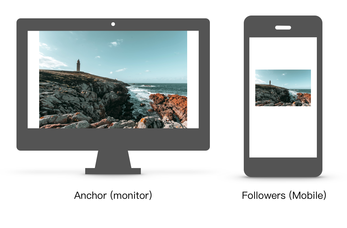
For example, we put a picture in the scene, and I hope that the picture is fully expanded on the screen of everyone in the room. So I set up an anchor to fill the anchor’s screen with pictures and other people as followers. We expect that on the follower's screen, the picture will fill the screen. However, the actual results may be unsatisfactory, as follows.

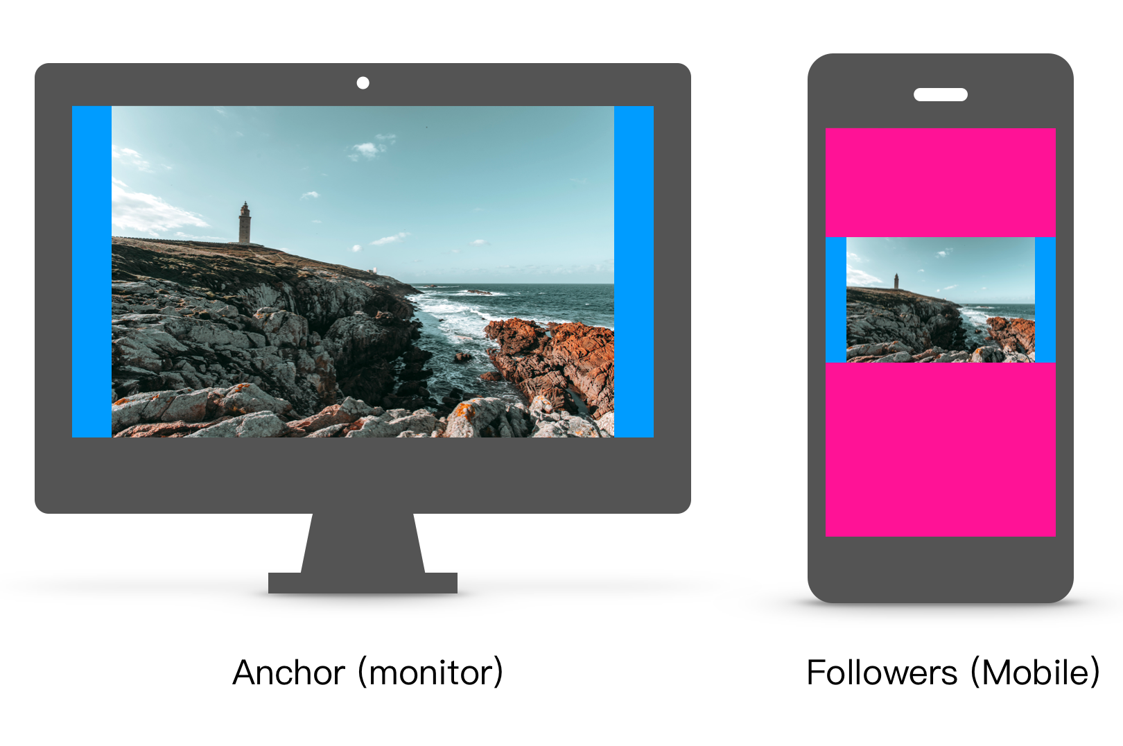
It can be seen that the picture on the screen of the follower (mobile phone) has a gap around it, not filling the screen. This is because the rectangle broadcast by the host is all the content that the host can see on the screen, and these contents include the pictures the host sees and the gaps on both sides of the pictures. Everything contained in this rectangle will be displayed on the follower's screen. The follower's screen will also faithfully display the gaps on both sides of the picture on the anchor's screen, which will eventually cause this result.

As shown in the picture above, we marked the gaps on both sides of the picture in blue on the anchor screen. The gaps on both sides of the follower's visual rectangle are marked with pink. This can be seen more clearly.
In this case, we should directly set everyone the same visual rectangle instead of setting the anchor/follower.